Background / context
According to the explanation in The Visual Display of Quantitative Information written by Edward R. Tufte (2009), data visualization is a way to convey measurable information through combined use of numbers, words and some basic graphic primitives, such as points, lines, color. And an excellent data visualization should provide viewers numerous information in the shortest time with the least ink in the smallest place. However, these words can not be regarded as a definition or the only principle which can work for all the information visualization projects being created today. Despite the information visualization growing popular in recent years, it is still not easy to give a definition or provide a series of principles to it (Manovich, 2010). This may be due to several projects being only now regarded as information visualization when several decades ago they were not considered as such. In another words, the conceptual horizon of information visualization expands.
If we review the most of information visualization projects which created in the last century or even earlier, it is obvious that the data or say the information is the most important things of the whole project wish to convey not the visual effect, for example, the Figure 1 shown below. Since data visualization was traditionally used as a tool to support analytic reason (Viégas and Martin, 2007), all graphic visual primitives used in those projects should based on the data. The forms of “visual” presentation is not the first thing. However, with the inevitable development of open data resources and the emergence of more and more convenient software tools and technology, it changes a lot. Everyone can create their own visual representations with relative ease. Especially those designers and artists who get rid of the restriction of data and graphic dimensions, they pay more attention to the visual expression and create some more elegant or say more artistic information visualization projects (Viégas and Martin, 2007). And even create physical artistic data visualization projects, for instants, the data sculpture (Figure 2).
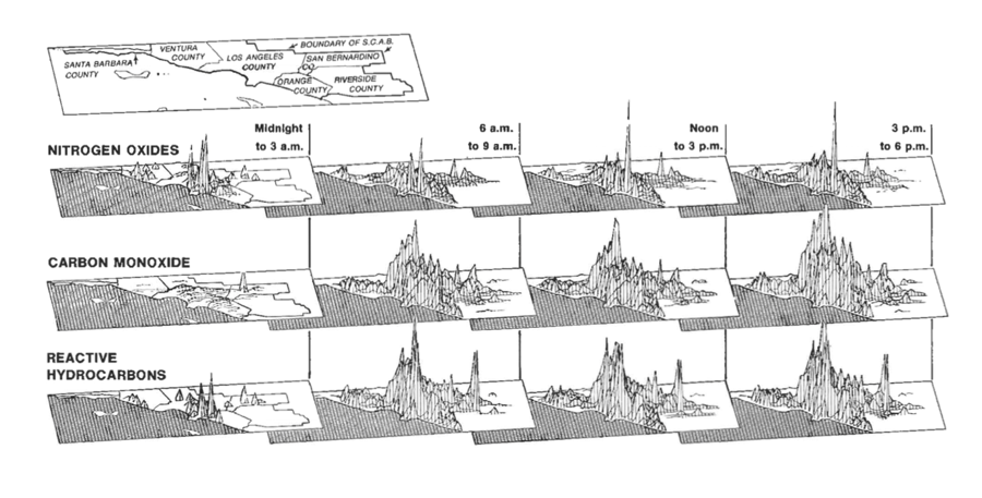
Figure 1: Los Angeles Time (1979), This is an information visualization shows the level of three kind of air pollutants at four different times during a day.
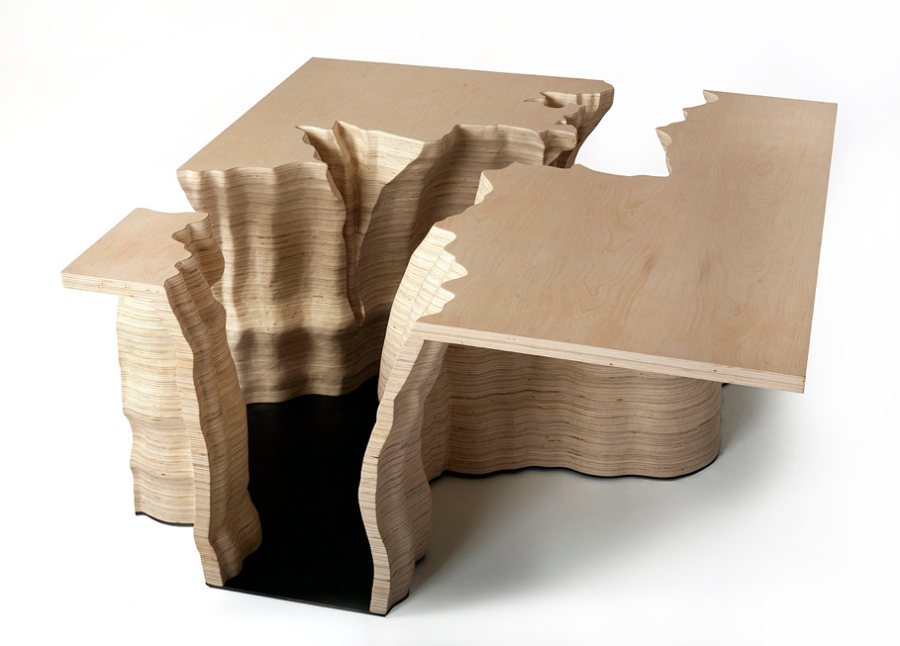
Figure 2: Examples of data sculpture: Adrien Segal’s Data sculpture TRENS IN WATER USE which shows national statistics of water usage in the United States over 50 years, from 1950 to 2000.
If provisionally definite information visualization as a mapping between data and a visual representation (Manovich, 2010), what this research proposal talking about is those information visualization projects which do more practices on the later——the more artistic information visualization.
Like the pragmatic information visualization which aim to analyze, study, explore or present data in a way that helps the viewers to completely understand the nature of data, the artistic information visualization in some terms still keep following the basic principles of data graphics (Kosara, 2007). It conveys information based on a true data and also convert quantified data which is not visual into a visual representation (Manovich, 2002). The differences between them are their goals and forms. The goal of artistic visualization is always to convey a concern, rather than to show data, although it bases on data. When it comes to the visual representation or say the forms, the concern of artistic visualization is usually transformed into something visible, interesting and even physical rather than making it conveniently readable, but that must still be readily accepted. With the different goals and visual forms, these artistic information visualization projects not only show data but also have more influence (Kosara, 2007). Especially the tangible artistic information visualization projects, it can be regarded as a combination of artistic information visualization and the data physicalization which allows people communicate and understand data through physical representations. They make information accessible, bring data into a physical world, in other aspect, these artistic physical representations which based on true data also influence viewers’ perceptual exploration skills and engage people (Jansen, et al., 2015).
Actually in Manovich’s article what’s visualization (2010), he has pointed out that although information visualization today still utilizes graphical primitives, besides the mainstream information visualization, there is another trend – without translating origin data into graphic signs, these projects use new visual representations which out of the graphic dimensions. And as it said before, since the open data and the development of technology, the forms of information visualization projects will be more and more diverse. However, even though there are lot of comment express that data physicalization and artistic information visualization can be beneficial. It is not realistic to expect them to be beneficial in all the situations (Jansen, et al., 2015). That is true, because there are still some sounds doubt the necessity of the beautiful or artistic forms of information visualization, such as the debate between the information designer David McCandless and graphic designers Neville Brody on BBC news-night.
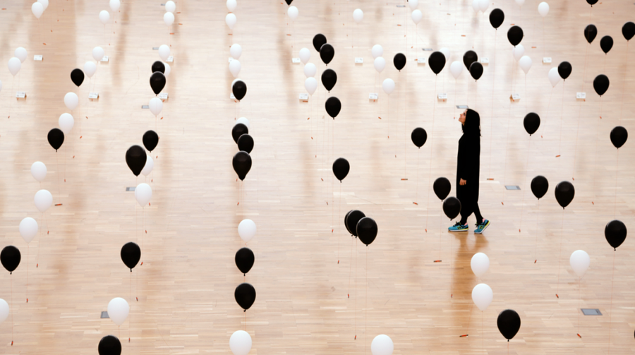
The Figure 3 is an example of artistic information visualization in a physical form created in recent year. This Lifeline installation created by a group named domestic data streamers is made up of a grid of 800 balloons which mark the point between one’s real age and the age at which they would like to die, contrasting the information with their gender. The coordinates where no one wants to die are represented in white, where as the ones that represent death are in black. This project visualized the information by the use of physical objects and it also used the contrast of color and spatial variables to convey information. So this project not only provides data but also presents an exhibition which really enhance the viewers’ involvement and cognition.
Figure 3: Lifeline, a information visualization installation created by DOMESTIC DATA STREAMERS.
Research problems / Project Aims
As a way to convey information, artistic information visualization not only present intricate data effectually, because the project is also a piece of art work, it also can enhance viewers’ sense of involvement and experience when they watch or read it, in some extent, that can lead viewers to think from a new angle. In other words, artistic information visualization projects focus on conveying concern. This research proposal is exactly about how to show the change of worldwide forest distribution during the late 20 Century in a way of physical artistic information visualization. As mentioned above, the artistic information visualization projects focus on choose the different form to convey information, so this projects will be different from those maps on the high school geography book. And the aim of the projects is to break the limit of the graphic dimensions and use a tangible form to express how the worldwide forest distribution changed during that time. And create the project in a more elegant and dynamic style to pique the viewers’ interest, and this interest can in turn be leveraged to make them spend more effort or time to understand and explore the important information which were ignored before (Jansen, et al., 2015).
Reference
Fekete, J.D., Van Wijk, J.J., Stasko, J.T. and North, C., 2008. The value of information visualization. In Information visualization (pp. 1-18). Springer Berlin Heidelberg.
Jansen, Y., Dragicevic, P., Isenberg, P., Alexander, J., Karnik, A., Kildal, J., Subramanian, S. and Hornbæk, K., 2015. Opportunities and challenges for data physicalization. In CHI 2015-Proceedings of the SIGCHI Conference on Human Factors in Computing Systems.
Kosara, R., 2007. Visualization criticism-the missing link between information visualization and art. In Information Visualization, 2007. IV’07. 11th International Conference (pp. 631-636). IEEE.
Manovich, L., 2010. What’s visualization. [online]. Manovich. Available at: < http://manovich.net/index.php/projects/what-is-visualization > [Accessed 14 December 2015].
Tufte, E.R., 2009. The Visual Display of Quantitative Information.2nd ed. Cheshire: Graphics Press LLC.
Viégas, F.B. and Wattenberg, M., 2007. Artistic data visualization: Beyond visual analytics. In Online Communities and Social Computing (pp. 182-191). Springer Berlin Heidelberg.
List of Figures
[1]. Tufte, E.R., 1979. Los Angeles Time. [figure] (Cheshire: Graphics Press LLC.)
[2]. Segal, A., n.d. Trends in water usage. [image online] Available at: <http://www.adriensegal.com/#!trends-in-water-use/c94g> %5BAccessed 1 January 2016].
[3]. Domestic Data Streamers, n.d. Lifeline. [image online] Available at:
<http://domesticstreamers.com/portfolio/lifeline/ > [Accessed 17 December 2015].
